
 The Adaptive Images creates responsive cropped images and serves only the appropriate version depending on the visitor’s viewport and device.
Different visitors have different devices (laptops, mobile phones, tablets), each with its screen resolution. The Adaptive Images considers the device’s resolution and then serves the right-sized image for each situation.
Let’s consider a webpage with a single 1200×600 pixels image when viewed from a desktop or laptop computer. Then, when the same website is viewed from a mobile phone, the image will be resized and served (for example) to 400x200 pixels, with the same visual quality. This way, neither time nor bandwidth will be wasted by visitors.
How it works
All you need to do is upload all of your images using the highest available resolution. Uncode Adaptive Images system will do the rest, and it will deliver appropriate newly created responsive images with the correct resolution to every browser and device. This will dramatically improve mobile device performance without compromising image quality.
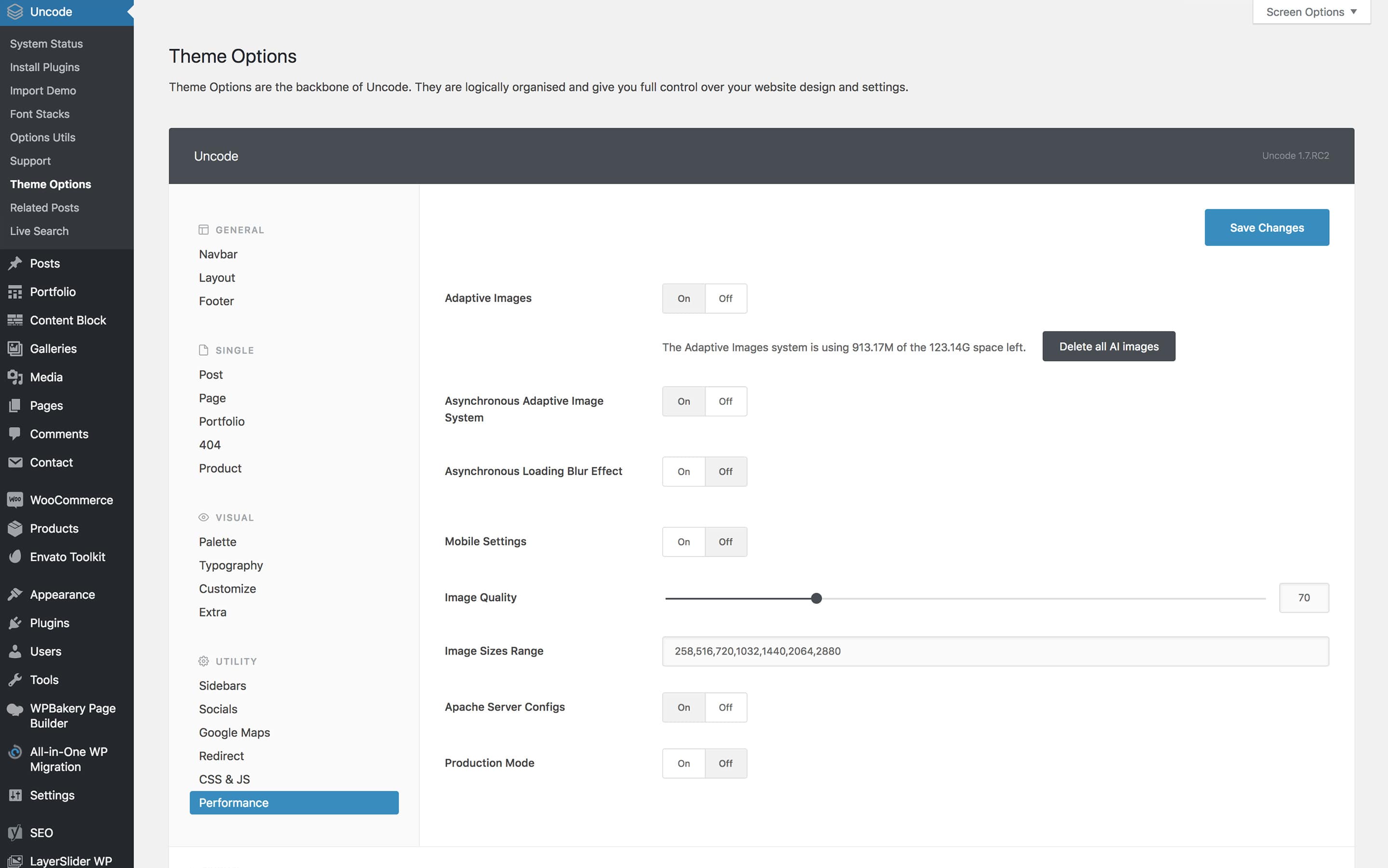
This feature is activated when the theme is installed. You can however deactivate it if you wish, in the Uncode → Theme Options → Performance options.
You can also use these options to monitor how much disk space this function is using, and if you choose, you can erase all recently created images without erasing the original version.
You will also notice the text area image sizes range features several values. These values represent the breakpoints the adaptive image system is using to create versions of your images. These values have been optimized to work in the best way possible, so only change them if you are confident in what you are doing (the values must be comma separated).
We recommend optimizing your images before uploading them as shown in this link.
Image Sizes Range
The Image Sizes Range option defines a series of breakpoints. These values represent the breakpoints the Adaptive Image system is using to create versions of your images. Please note that these values have been optimized to work in the best way possible, so only change them if you are confident in what you are doing.
Asynchronous Adaptive Images
To increase the already good performance of Uncode even further we have implemented a new great feature called Asynchronous adaptive image. With this option, you will improve your page loading time and all the ratings from website metrics tools (PageSpeed, GTMetrix etc.)
To activate this option you need to go to Theme Options → Performance and set the Asynchronous adaptive image option.
When activated this function all the images will be first loaded with a very low resolution to reduce dramatically the loading time of your page. Once the page is loaded the images will be replaced by the adaptive image fitting the visitor device.
This function has to be activated if you are using a page caching system (WP3 Total Cache, Varnish, etc).
Delete all images
This option, when chosen, deletes all images. It states your current total usage and storage of images being used by the adaptive image system. By clicking this button, you will delete all images and free space. Note that this gives you the option to erase all images you have created, without erasing the original version.
Mobile Settings
These are options to make mobile performance more efficient:
- Use Current Mobile Orientation Width: Activate to use the current mobile orientation width (portrait or landscape) instead of the max device's width (landscape).
- Limit Device Density: Activate to limit the pixel density to 2 when generating the most appropriate image for high pixel density displays.
- If you activate the following options you can also use these Image Sizes Range
258,375,414,516,750,828,1032,1440,2064,2880, note that upon request, Uncode will create more versions of Adaptive Images on your server.
Image quality
This option, when selected, adjusts image compression quality. Simply drag the slider to specify the preferred compression. The specified compression is the quality of your images calculated as a percentage. As an image is compressed, its quality is lessened. Image compression can be useful however in high-density websites.
Image size range
A third adaptive image option defines image size. When Uncode is activated, this option is already filled with values of all the breakpoints the adaptive image system is using to create versions of your images. To add your own sizes, simply enter your preferred values, separated by commas, after you click save all, the images will adapt to the new sizes.
Important: These values for the image sizes have been fine tuned to work in the best way possible. Make sure you know what you are doing if you intend to change them.
How to optimize image before and after
If you are interested in more information on how to optimize images before uploading to your site or how to optimize responsive thumbnails created by WordPress and Uncode, please visit this article:

Comments
0 comments
Article is closed for comments.