
 The grid system of Uncode was conceptually inspired by that of Bootstrap and uses a similar modular approach. A grid system is used to create page layouts through a series of rows and columns that form content containers.
The most important aspect of columns are:
- Content should be placed within columns; and only columns can be immediate children of rows.
- Columns create gutters (gaps between column content).
- Grid columns are created by specifying up to 12 available columns.
- Columns are stacked for mobile view.
Aspect
In this section you can define the fundamental aspects of the structure of the layout including width, height, and padding:
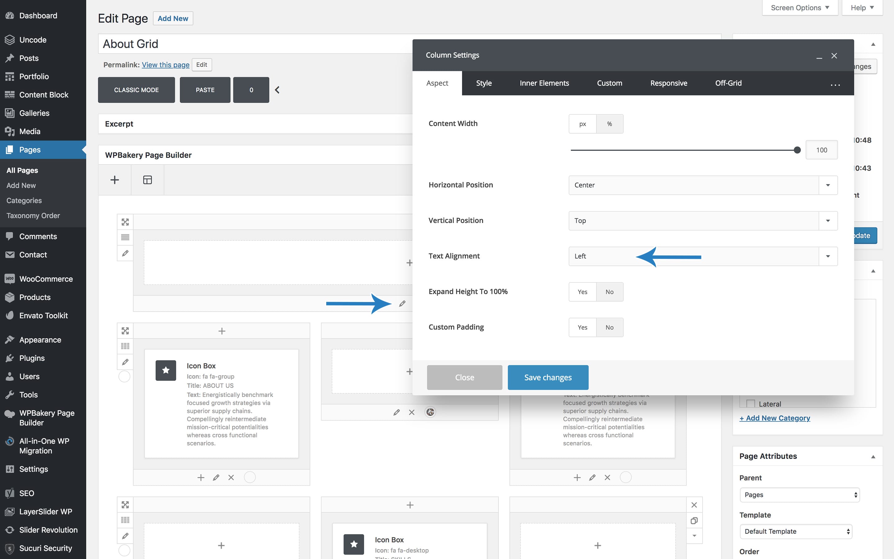
- Content width: Set this value if you want to constrain the column width, screenshot.
- Horizontal position: Use this option to specify the horizontal position of the content if you have decreased the width value from 100%.
- Vertical position: Use this option to specify the vertical position of the content.
- Text alignment: Use this option to specify the alignment inside the content box, screenshot.
- Inner vertical spacing: Use this option to set the vertical space between elements from 7 presets.
- Extend height: Activate this option to expand the height of a column to 100 if you haven’t previously activated the equal height row setting.
- Custom padding: Activate this option if you wish to define custom paddings, screenshot.
Style
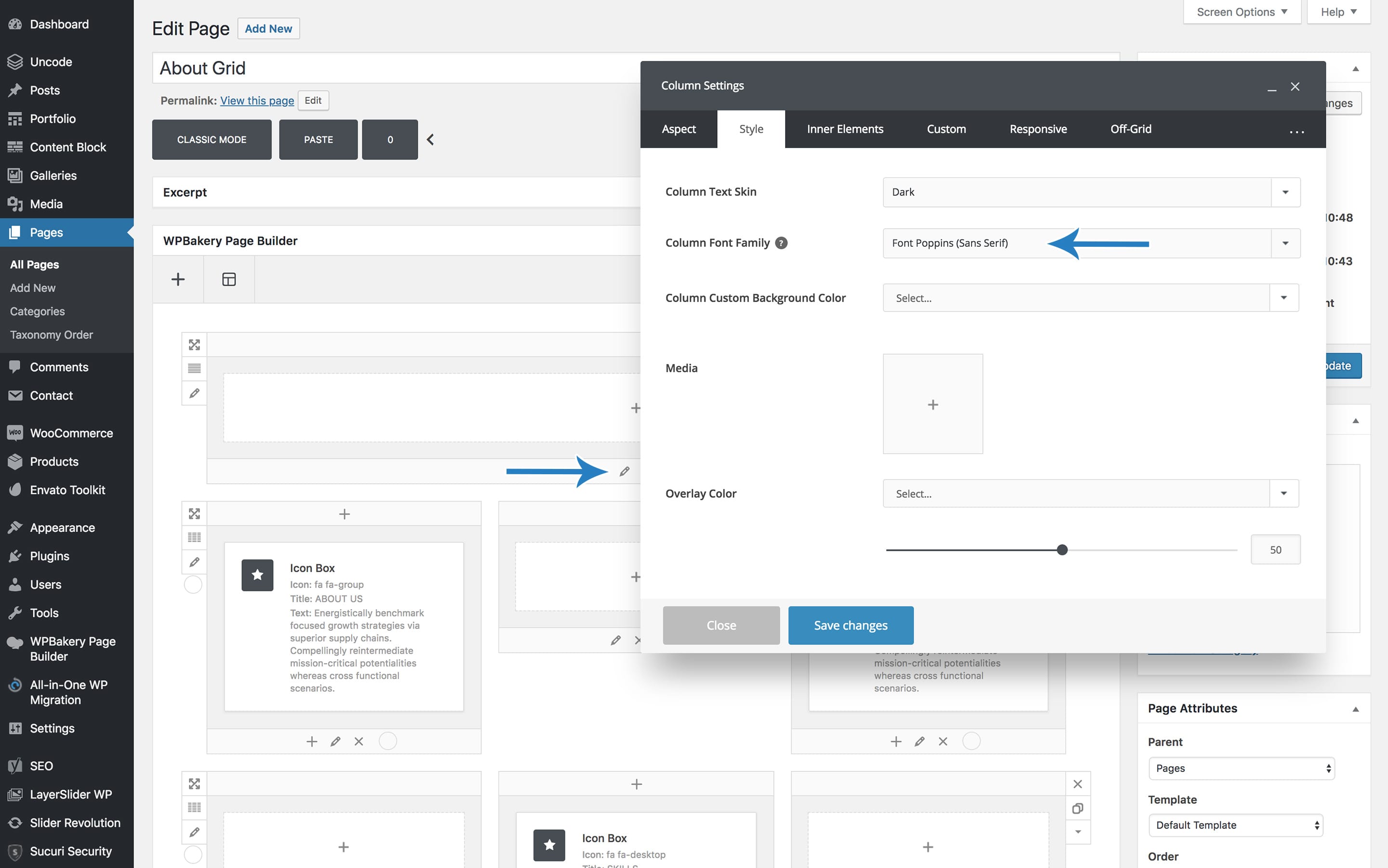
In this section you can define the fundamental aspects of column style, including background color, background image, and parallax effect.
- Skin: Use this option to specify the text/skin color of the column, screenshot.
- Font family: Use this option to specify the column font family, screenshot.
- Background color: Use this option to specify a background color for the column.
- Background Media: Use this option to specify a media from the media library.
- Background CSS: Use this option to specify the main CSS properties for the background media.
- Parallax: Activate this option if you want to add a background parallax effect.
- Ken Burns: Activate this option if you want to incorporate a background Ken Burns effect.
- Zoom Out: Activate this option if you want to incorporate a background Zoom Out effect.
- Overlay color: Use this option to specify an overlay color for the background.
- Overlay opacity: Use this option to set the transparency for the overlay.
Custom
In this section you can define the CSS overrides:
- CSS: Use this option to specify custom overrides for margin, border and padding.
- Lateral border mobile: By default, columns are stack on mobile, and lateral borders are hidden. Use this option to preserve custom lateral Borders on mobile.
- Border color: Use this option to specify a border color.
- Border style: Use this option to specify a border style.
Responsive
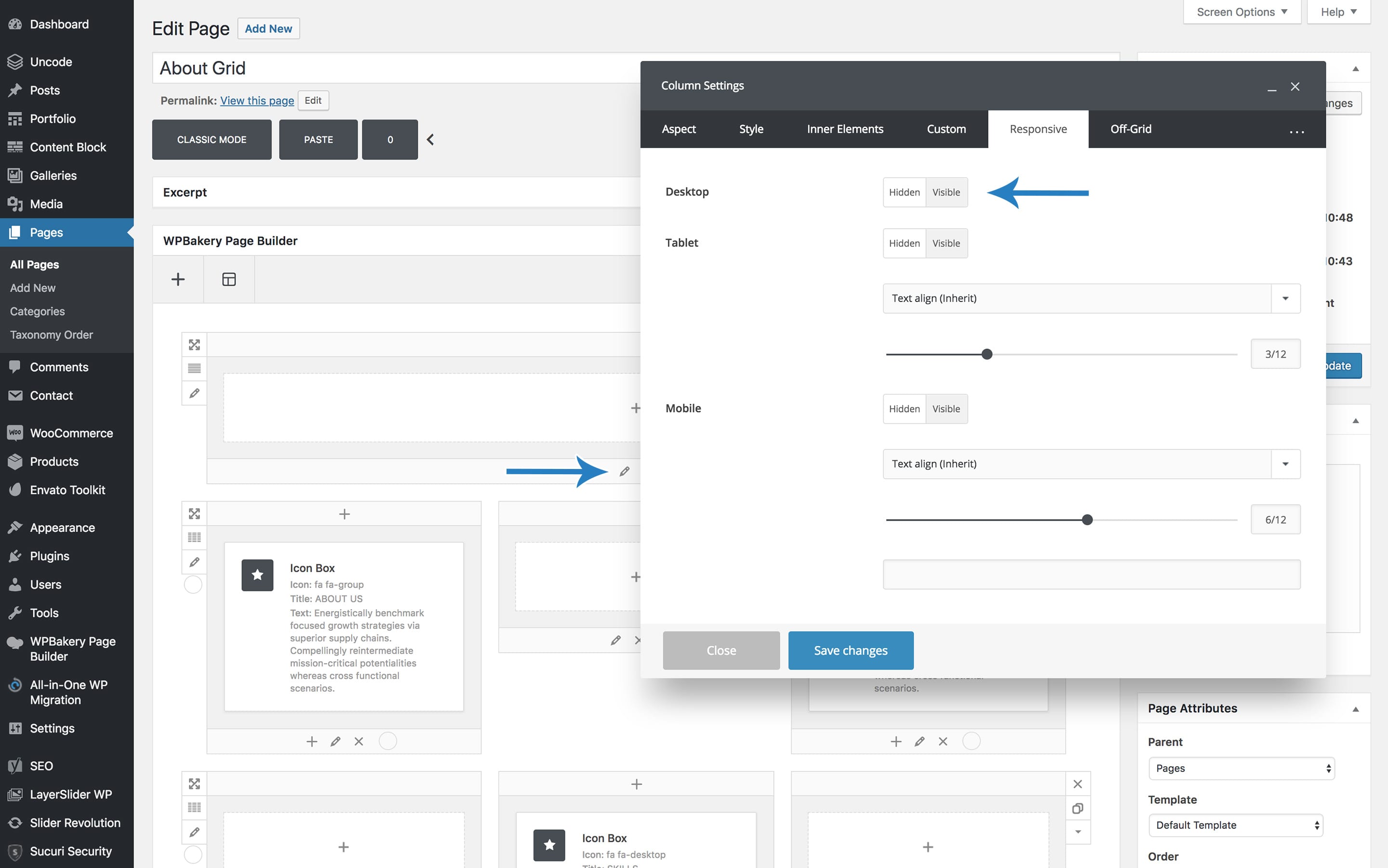
In this section you can define the aspects that influence visibility and responsive behaviour, screenshot.
- Desktop: This option is used to select the visibility of the element when in desktop layout mode (>960px ).
- Tablet: This option is used to select the visibility of the element when in tablet layout mode (570px – 960px).
- Tablet text alignment: Use this option to specify the text alignment inside the content box when in tablet layout mode.
- Tablet column width: This option is used to set the column width when in tablet layout mode.
- Mobile: This option is used to choose the visibility of the element when in mobile layout mode (< 570px).
- Mobile column width: This option is used to set the column width when in mobile layout mode. NB. If you change this value for one column you must specify a value for every column of the row and the total sum of the columns must be 12 (ex: 3/12 + 9/12).
- Mobile text alignment: Use this option to specify the text alignment inside the content box when in mobile layout mode.
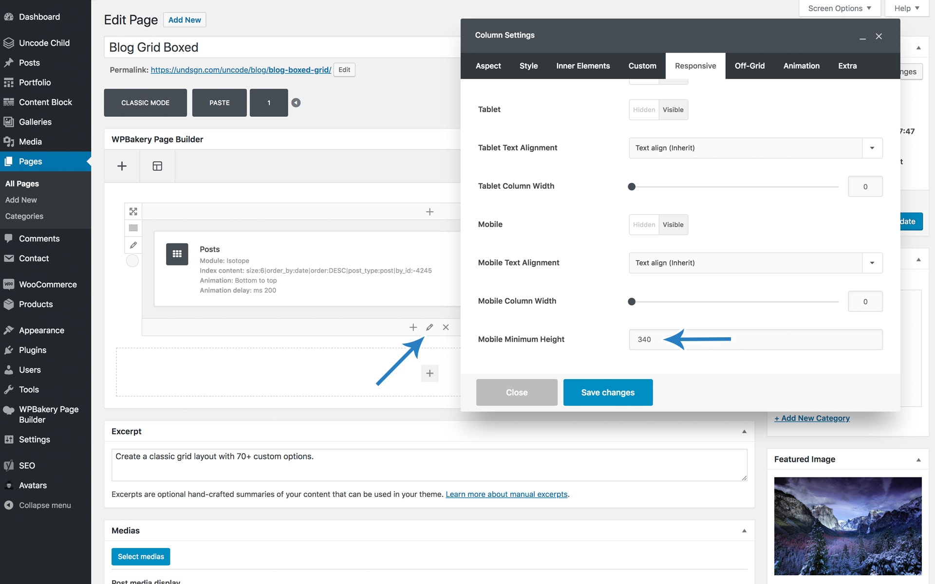
- Mobile minimum height: Insert the value in pixels, screenshot.
Off-grid
In this section you can define “out of the grid” effects, screenshot :
- Shift x-axis: This sets the amount the element needs to be shifted on the X -axis.
- Shift x-axis fixed: Use this option to deactivate shift-x responsiveness.
- Shift y-axis: This sets how much the element needs to be shifted on the Y axis (use the Margin Top property).
- Shift y-axis fixed: Use this option to deactivate shift-y responsiveness.
- Shift y-axis Downward: This sets how much the element needs to be shifted on the Y axis (use the Margin Bottomproperty).
- Shift y-axis Downward fixed: Use this option to deactivate shift-y Downward responsiveness.
- Custom z-index: Use this option to set a custom z-index to ensure visibility of the element.
Animations
In this section you can define animations input for a column:
- Animation: Use this option to specify the entrance animation from 8 presets.
- Animation speed: Use this option to specify the entrance animation speed from 10 presets.
- Animation delay: Use this option to specify the entrance animation delay from 20 presets.
Extra
In this section you can define additional functionality and apply custom CSS classes:
- Custom link: Used to enter a custom link for the column.
- Sticky: Activate this to stick the element when scrolling on desktop.
- Shadow: Activate this for the shadow effect, screenshot.
- Border Radius: Specify the border radius effect.
- Extra class: If you wish to style a particular content’s element differently, use this field to add a class name and refer to it in your css file.
- Element ID: If you wish to style a particular content element differently, you can use this field to add an ID name, and then refer to it in your CSS file.

Comments
0 comments
Article is closed for comments.